Digital Stroll
Kim Siyoun

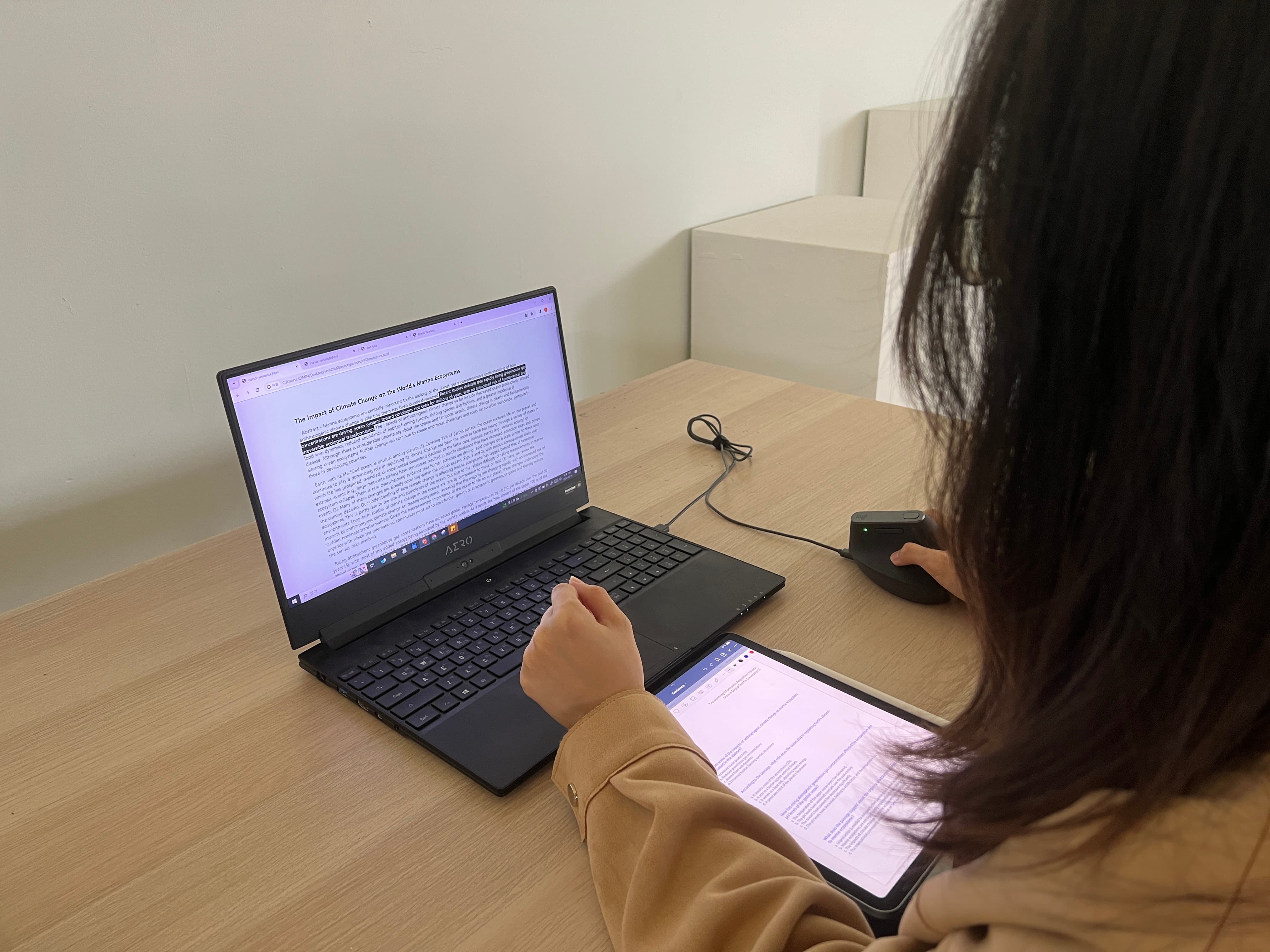
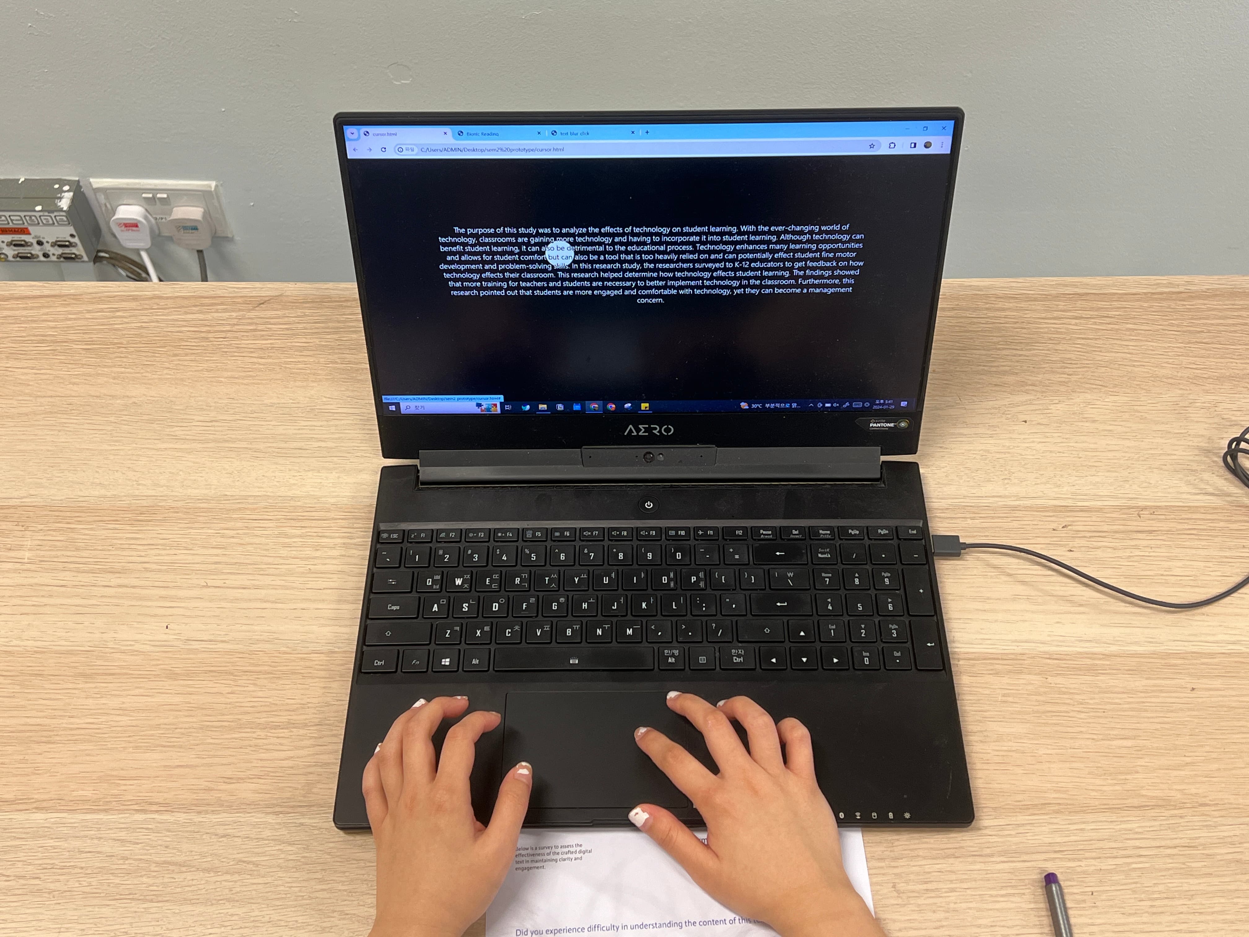
Given the shift in our information acquisition methods, Gen Z struggles with traditional text-based information, including academic papers. Digital Stroll seeks to address these challenges by improving their reading experiences, through interaction with digital text and emphasising details like typography and line spacing. Ultimately, it seeks to gain an opportunity to evolve digital texts into more effective forms of information dissemination.
I'm sure you've done some research on the current state of how text is presented on websites. Since your focus is on digital texts, what do you think of the current state of website designs or text on digital screens? Are you satisfied there? And where can we go from here?
I don’t find myself satisfied with it. Especially with academic articles, when you just find the PDFs through Google Scholar and when you click down, most of them are like really, really long text. There's almost no design inside. Maybe that's the layout design but those designs are based on how the book is printed. So if you see a lot of text at first glance, you would feel like, oh, this might be really stressful or this might require a lot of concentration. I didn't like that part of it.
Since we're reading the text on digital devices, I'm sure there are a lot of possibilities
of how we can go about it since technology has advanced. We can use more interactive elements. For
people that are reading, the text could just focus only on the parts that they're just reading. Or,
we can also go about this through the layout design, not just putting the whole text into one page.
We can divide some of the text or we can add some interactions which make the readers for example,
move their mouse while they're reading the contents itself.
Your effort lies in making it easier for people to read. Could you describe your application and what it does?
The application has different kinds of options which have different ways the users can interact. One option makes each part of the text blurred. Or some of them, it just highlights each of the sentences. They just work in different ways. The application — or I call it the reader — lets the users change the font size, typography, line length and everything. So that's how the application might work for them. For the final outcome, I would also like to make the application work on iPads or mobile devices, not just laptops. That's just my dream.
Earlier, you mentioned that people may find it overwhelming when they open up a PDF and they think that it's going to be hard for them to concentrate and get through the readings. How do you think this impression differs for print?
The biggest difference would be the hyperlink. So when you are just trying to read a physical book, you can read without any interruptions. Maybe there might be interruptions in the physical environment, but not through the books. However, for the digital text, there's hyperlinks. The users have to keep finding out information through the hyperlinks; keep going and going and that's actually part of non-linear reading. But the point of non-linear reading is that users need to find information by themselves. They need to think by themselves, rather than the book itself is giving you the information. That actually makes them feel tired or overwhelmed.
Do you think there's parallels between the way we read physical books and on screens? You were pointing out how you use your mouse to highlight and guide your eyes. I noticed that we kind of do it with physical books as well. We use our fingers to point where we are at. So have there been any other observations that you've made when it comes to the behaviour of reading?
For me the bookmark is the most basic thing. While you're reading physical books and there's something happening where you have to stop reading, then you just put a bookmark on that page, or you just turn the books down and just go on other things, right? But for the PDF — especially academic readings — you don't have the bookmarks actually. Maybe it exists on Adobe PDF reader or something like that. But mostly, when you just read by just searching through things like Google Scholar, you don't have the bookmarks. So that was the point that I also observed first. So I'm planning to put those kinds of options inside through the readers.
See Exhibitions beyond Immersive Augmented Reality, and Tangible Theatre