Visualising Censorship
Zhang Xin Yi

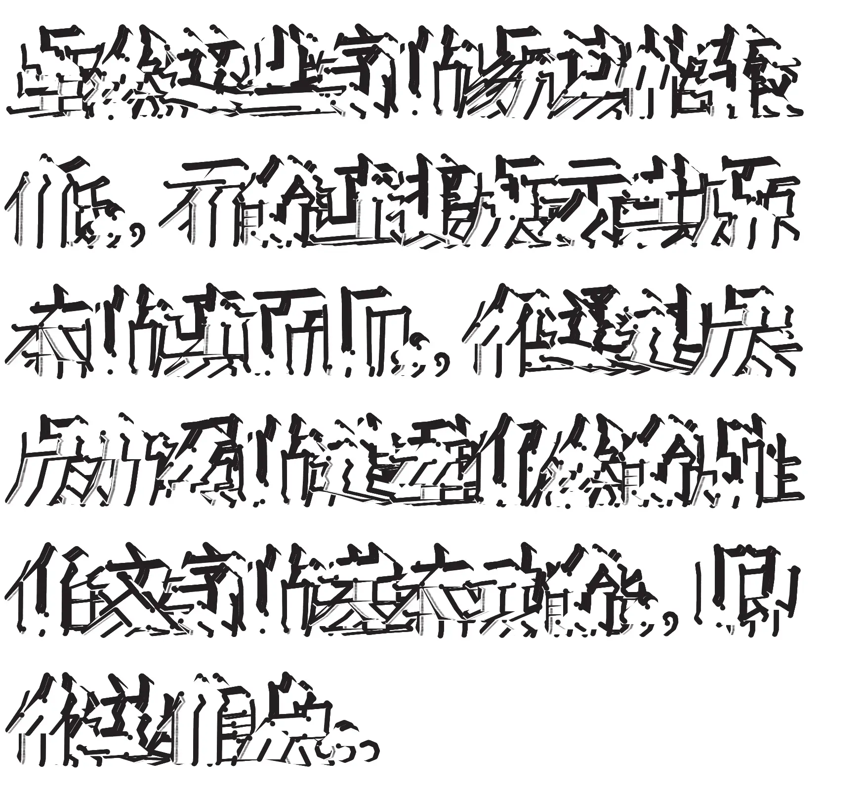
Visualising Censorship is inspired by the steganography of obscuring letterforms practised by online users in China to evade censorship. While referencing this effective strategy of using illegibility, Xin Yi’s project views the act of hiding letterforms as a creative tool that plays around the active space where letterforms operate in our mind, offering new visual opportunities. Through an experimental approach, her outcomes explore the potential of poor legibility, not only as potentially productive but also as inherently creative.
For most designers, legibility is of utmost importance, which is why I find your work intriguing. How did you go about creating these experiments? Did you start off with rough sketches or did they start with different concepts?
None of them started with rough sketches because the outcomes I present were not anticipated beforehand. To adhere to the experimental nature, I followed the approach outlined by type designer Peter Bilak, where the designer initiates a cause-and-effect process and embraces the uncertainty of the outcome. Therefore, my goal was to steer away from a product-driven or pre-formulated outcome.
Almost all of them began with a question about working with type that I found interesting and thought
might yield unexpected results. For example, what if I disintegrate a Chinese character to the point
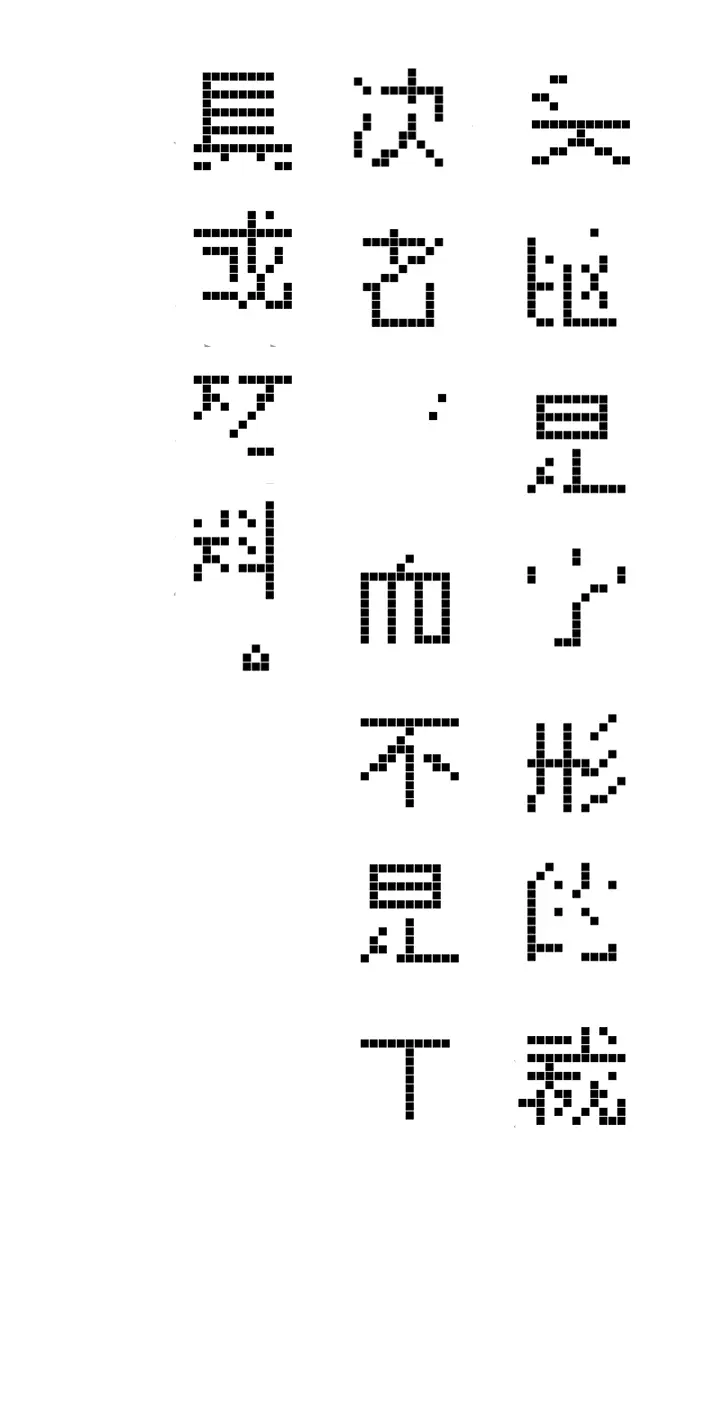
of almost disappearing, or what if I make the dots of a dotted Chinese character repel each other? I
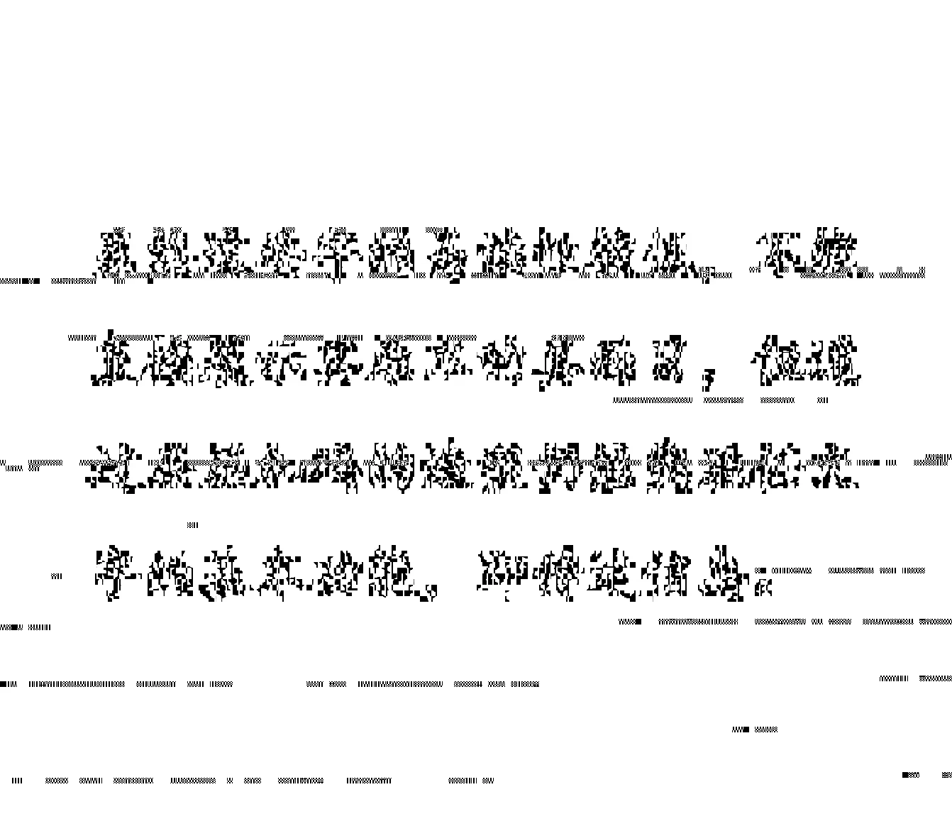
explored what visual possibilities could be uncovered by misusing the tools in certain ways to
create type-related outcomes, such as deliberately pushing the limits of data capacity that the
Least Significant Bits (LSB) can carry and hide data.
What were some of your favourite experiments?
Each experiment has its unique aspect, but the one that I feel the deepest
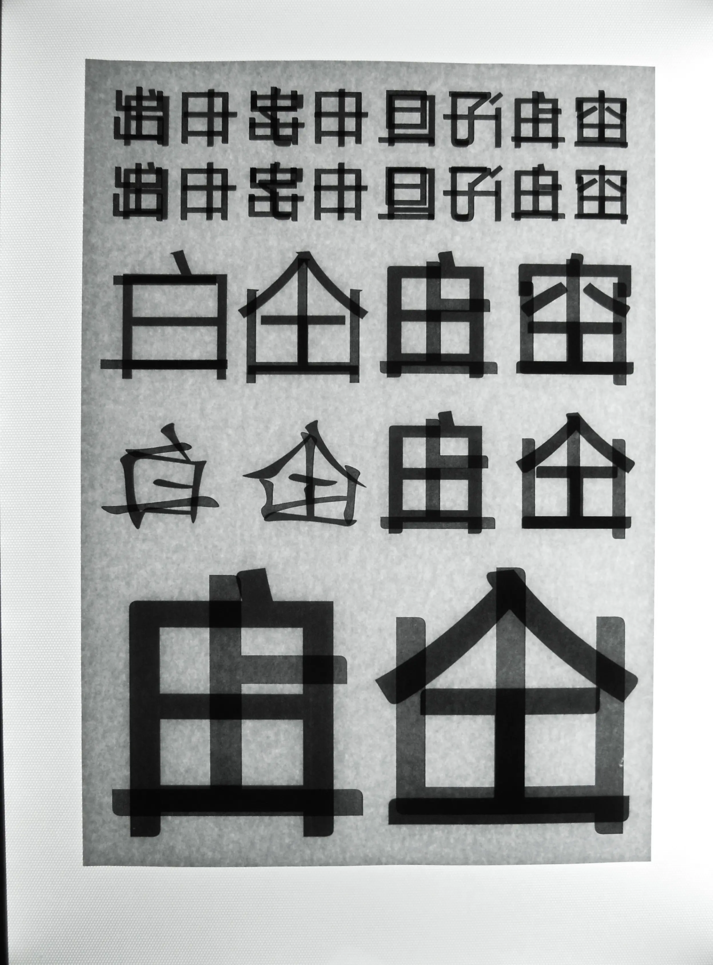
connection to is the "Show-Through Paper" experiment. In this experiment, I needed to construct a
character using the show-through nature of paper by distributing different characters on the front
and back and using their overlap to suggest the intended word. While this may not be the most
visually engaging work, it holds significance because it was inspired by a real online social media
phenomenon where Chinese netizens used indirect communication to circumvent censorship. Witnessing this phenomenon go viral and then get deleted
left a lasting impression on me, and it served as a major starting point for my research project.
How has this series of experiments shaped your perspective as a designer? Did you have any insights and takeaways from your project?
Apart from my appreciation for Chinese typography/type has deepened, it made me
realise that working towards an unknown outcome can be just as enjoyable as striving for an expected
result. Typically, designers aim for legible and expected outcomes, but through experimental
typography, I learned to value both legibility and poor legibility for their ability to enhance
understanding. I feel liberated from the constraints of what constitutes a legible character, yet I
also recognize the importance of restrictions for creating intriguing obscuring effects.
 Additionally, delving into steganography and censorship expanded my understanding of typography. It
made me realise that sometimes the form of obscuring is more important than the content it delivers.
See Copycat! (real)
See Folia Imprints, Garbage Playtime!, and The Dish is Your Canvas
See Creativity as a Commodity, and I Grew Up Fine