experiment 4
SHOWING AND HIDING ACTANTS’ PERSPECTIVES WITH JQUERY TOGGLE
Links to Experiment 4, Experiment 4a, Experiment 4b and Experiment 4c
Links to Experiment 4, Experiment 4a, Experiment 4b and Experiment 4c
In Actants in a Timeline, I made a reflection that there are points in a story where not all the actants are mentioned in. If I were to take the original text, I could have those missing perspectives brought in using the jQuery hide and show effects.
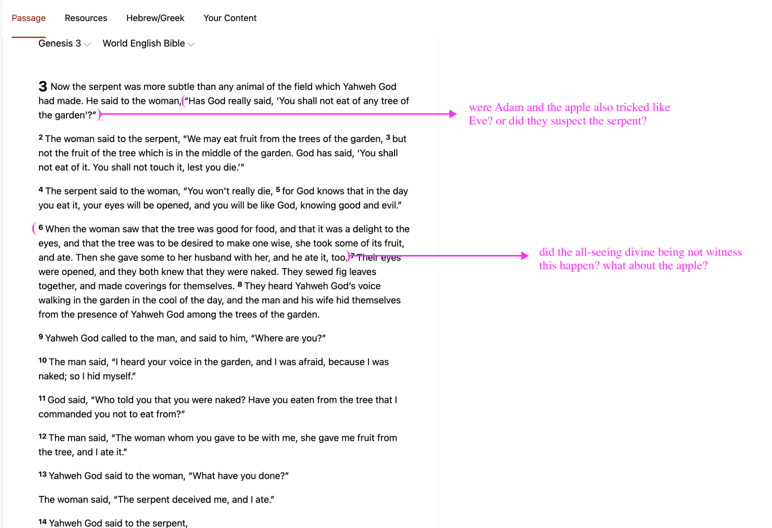
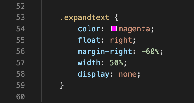
After replicating the source text in my code editor, I added these missing perspectives to a few places in the text. These perspectives are given the class .expandtext.
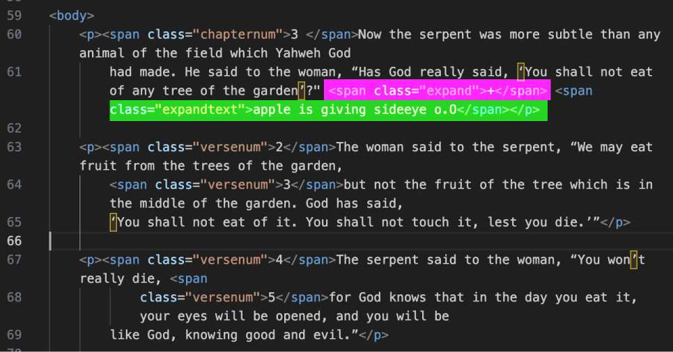
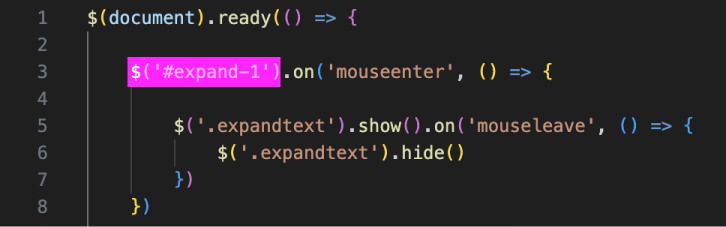
I used mouseenter and mouseleave as the event handlers for the show and hide effects respectively. The target for the events are set on the + symbol which has the class .expand. This code did not contribute to any visible change and it’s probably because I was targeting classes for both the trigger and the effects.
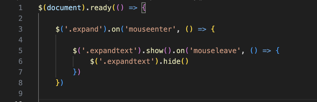
Just to test a more specific approach, I tried creating and targeting an id for the first ‘+’ button. Although hovering over the button made all the expanded texts visible, I was glad that at least something changed.
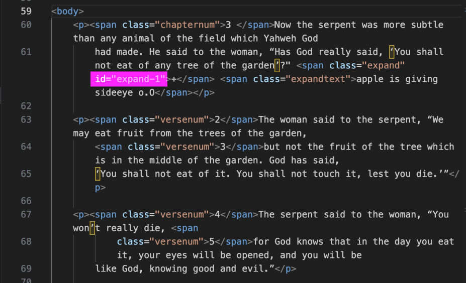
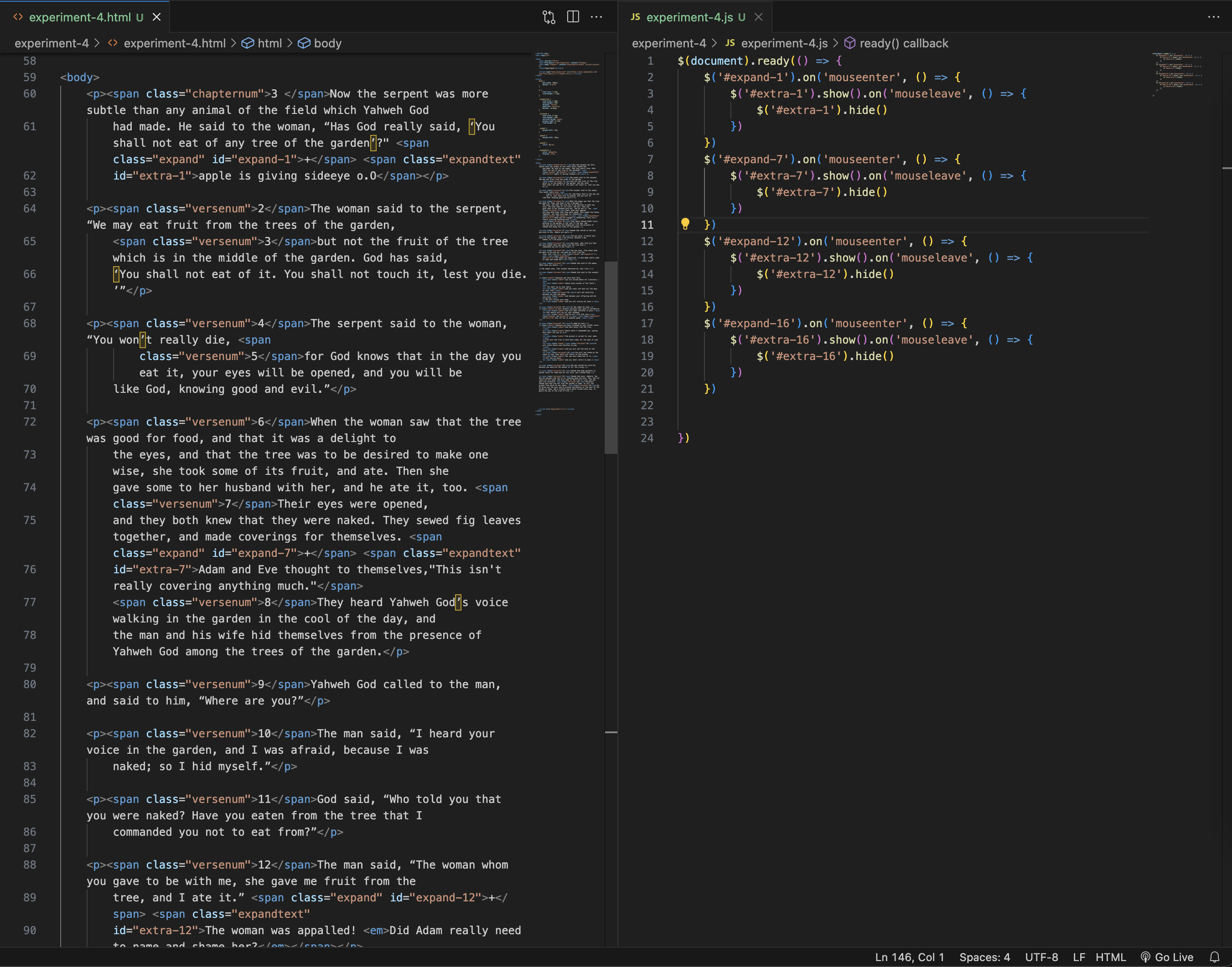
Since I was already creating an id for the first + button, it made sense to create ids for the additional texts too. This led to repetition in my JS code where the show and hide effect can be seen four times, just with different ids.
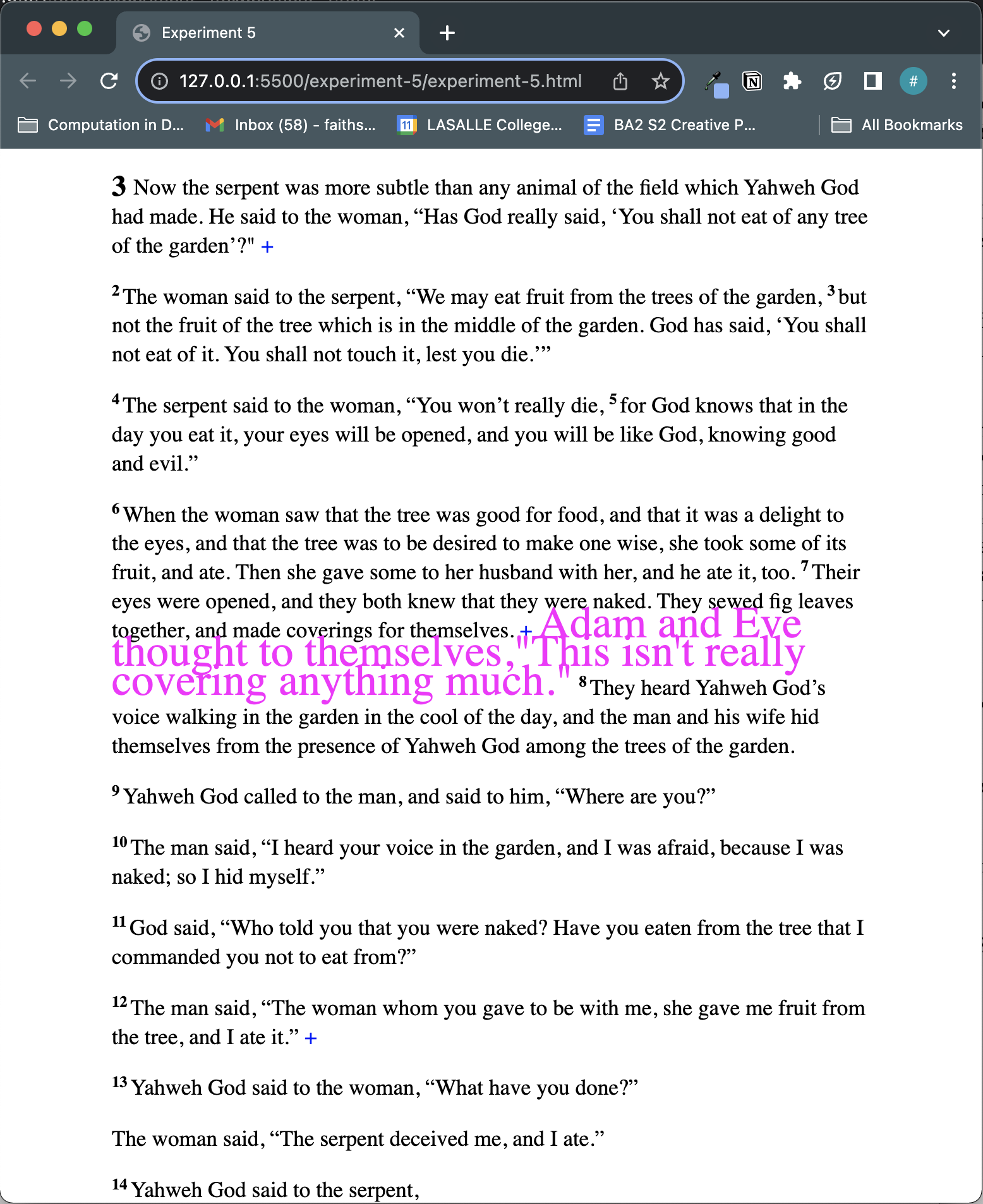
One thing that I liked seeing in this experiment is how the text interacts when the expanded text is situated in the middle of a paragraph. The sentences following the pink text actually get pushed down.
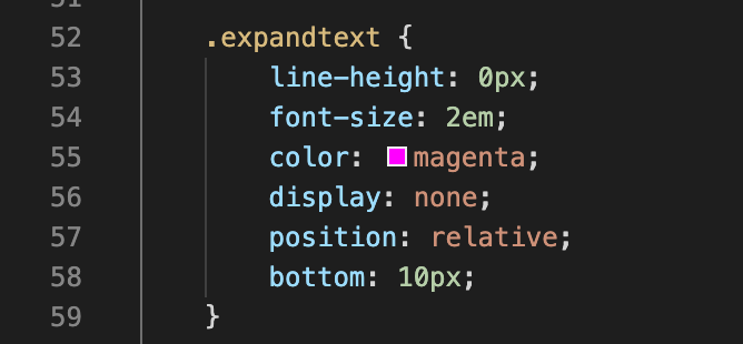
This experiment was inspired by the use of negative margins, but instead, texts are overlapped using a line-height value smaller than the font-size.
To further distinguish the expanded text from the original biblical text, I tried separating them using float. When adding this float effect, I thought it didn’t work at first but I realised that I had to scroll to the right to see it. This definitely wasn’t the intended effect but since the width of the body was 87.5%, there wasn’t enough room to view the expanded text in the viewport. So a quick fix would be to reduce the width of the main passage.
When the margins are removed, the effect seems a little more interesting; the expanded texts look as if they are bubbles in water.